Viasat usage experience overhaul
Years of business-driven design necessitated a customer-centric approach to revamping the entire usage experience

The what
Ongoing complaints from Viasat residential internet customers indicated that the current usage experience in the self service portal obfuscated information about data usage.
…so what?
Viasat internet is data capped. Satellite beams can only support so much traffic and after exhausting high-speed data for the month, speeds seriously degrade. Without data transparency it's near impossible for customers to plan their data usage for a data cycle, leaving them vulnerable to slow speeds and unplanned data overages.
Solution
The new experience utilizes clear and transparent messaging about data usage. There is a focus on educating and guiding customers from the moment they begin using data to the moment to run out. After implementation, the team saw a 70% drop in customer survey complaints about their data usage management experience.
My role
Lead designer
Contributions
Identified the problem during a review of our customer feedback survey with the product manager
Presented findings from usability heuristics audit to senior leadership to secure funding for the project
Worked closely with UXR to take the proposed solution through 2 rounds of usability testing
Designed high-fidelity features and component states
Time to launch
2 months
Overhaul highlights —


Simplified usage states, in plain English
Content readability is improved by focusing the main text on data remaining. When users are out of data, status is elevated with a warning badge. And the quick glance visual usage meter is visible in every state of the component so users can quickly get a sense of how their data used plays in tandem with their data remaining.

Big picture, little picture
With finite data, managing internet is important. Historical totals of used data types help our users better plan for months ahead and make sure they're on the most efficient plan for their life.


Guidance, when it's needed most
It can be a slow and frustrating process to buy more data when you've already run out— we implemented global push alerts to help users stay in front of their data and buy more before they run out
The process —
Problem
How much data have I used?!
After hitting their high-speed cap, users had no way to see how much additional (throttled, slow) data they had used. And when customers purchased additional high-speed data to keep speeds high for the remainder of the month they had no way to monitor their usage of that pricey data add on.
Unsurprisingly, when customers couldn't find the information they were after in the My Viasat self-service portal, they called Customer Care which was driving high call center costs.

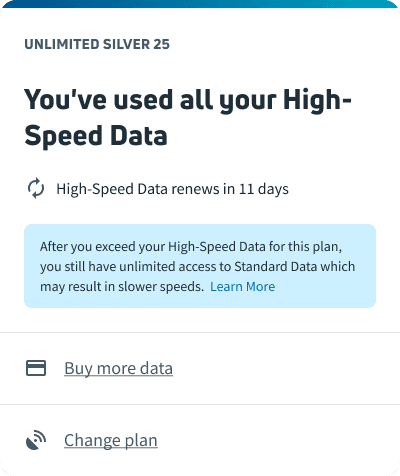
The old data usage overview before and after a user consumes all of the high-speed data in their plan
Research
Exactly how bad is the problem?

Before beginning design work, I took advantage of the fact that we had an existing design: I audited our current usage experience with a usability heuristic audit template from the UXR team.
Major usability problems
Obfuscation of standard data used after high-speed is depleted
Minor usability problems
Findability of 'Buy more' and 'Change plan' is low
Cosmetic usability problems
Hovering interactions on daily usage viz do not match location expectation and the motion is jarring
Design
Getting to the solution
First attempt: helping customers pace their data
We focused on improving the usage meter in the widget in the upper lefthand side of the page. We were hoping to help users understand their pacing bette by pairing a meter showing data usage above a meter showing days in bill cycle.

"Users wanted more detail about usage granularity and expected that information to be easily available."
—UXR report
Second attempt: helping customers get out of the hole
In fact, the problem to solve turned out to be less about helping customers not outpace their high-speed data cap, but provide more guidance to them when they inevitably do. This led us to involve the larger data usage module so that we could utilize that real estate for a more granular look at customers' data breakdowns.
"Lorem ipsum dolor sit amet."
—UXR report
Outcome —
70% drop
Post launch, we saw a 75% decrease in survey feedback pertaining to a poor data usage management experience.
While you're here…
